Gaptooth Soda
Perfect Teeth Are Overrated. So Is Perfect Soda.
Industry
- Soda
- Packaging
- Drink
Year
Services
- Packaging
- Brand Identity
- Animation
- Copywriting
- Naming
- Photography
- Strategy
Brief
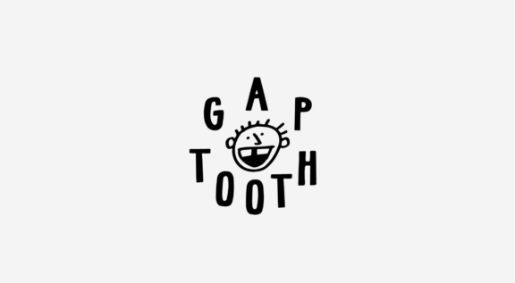
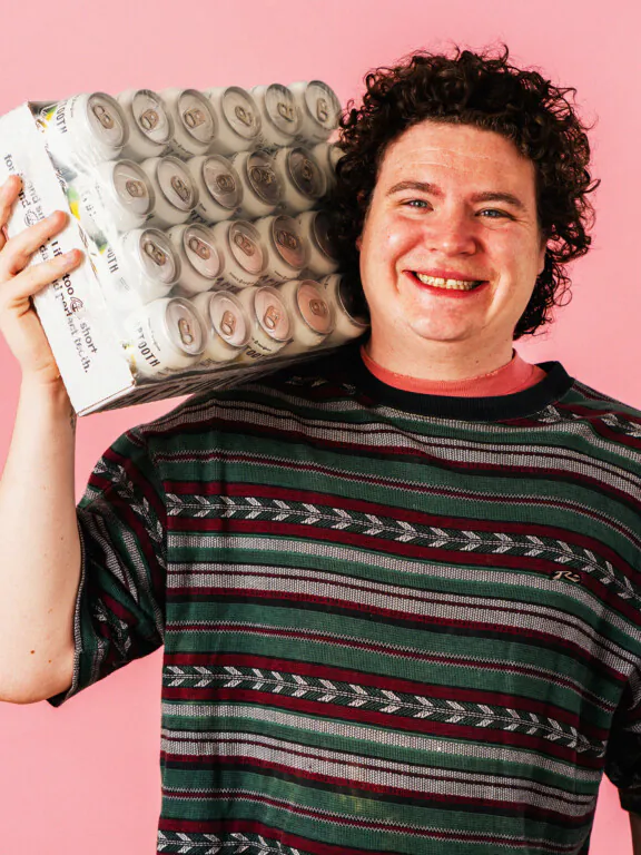
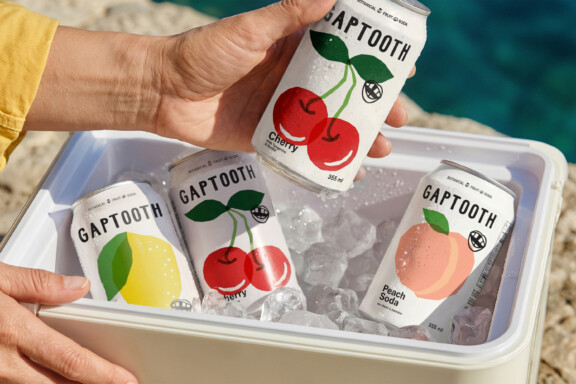
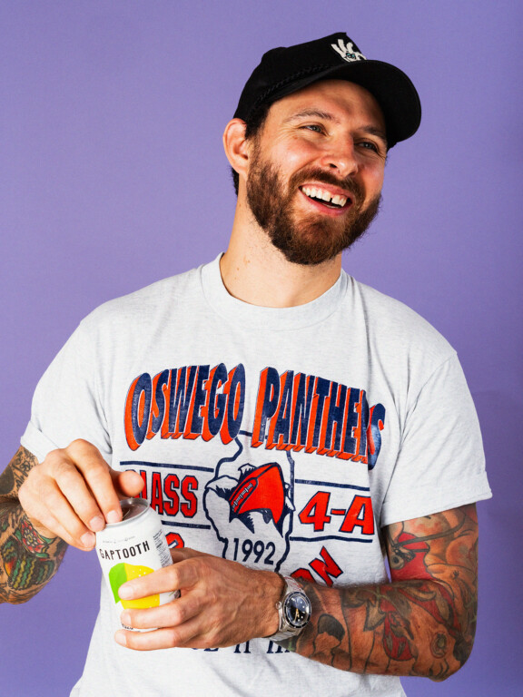
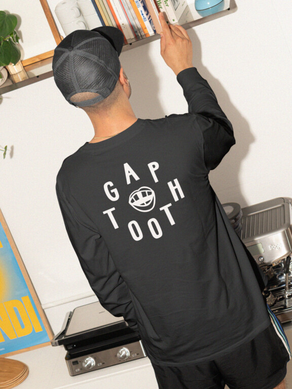
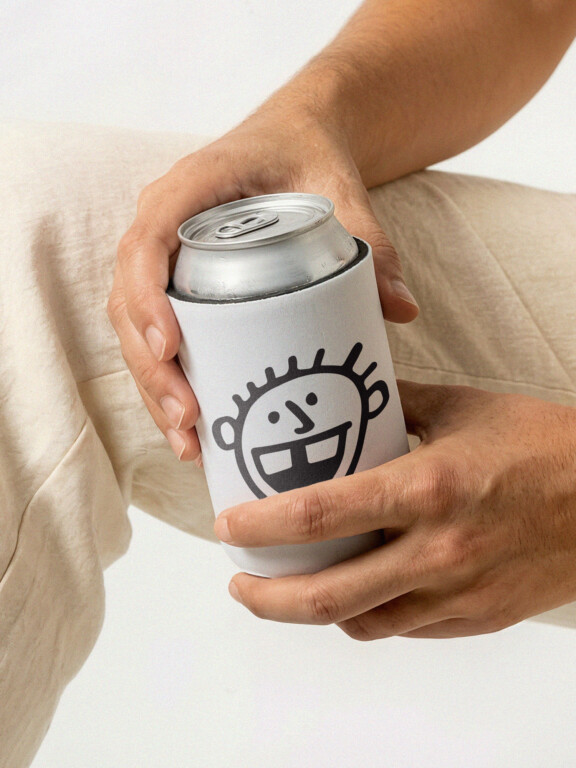
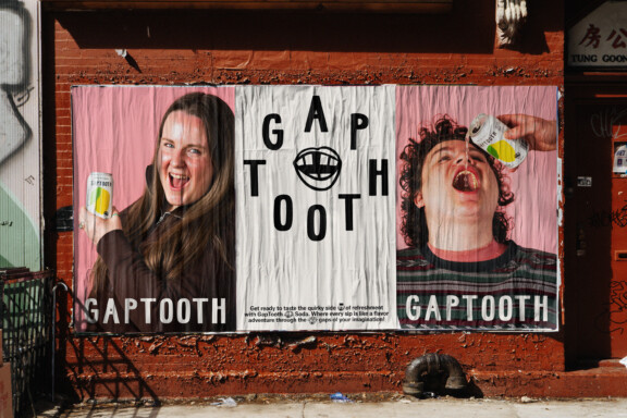
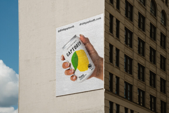
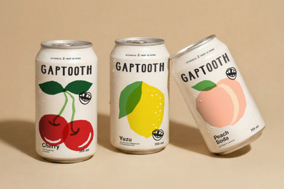
Gaptooth Soda is a Toronto-based botanical soda brand created by founder Owen Walker and designed by Saint-Urbain. Built around the idea that imperfection can be a strength, the identity turns a gap-toothed smile into a distinctive brand system spanning packaging, illustration, and messaging.
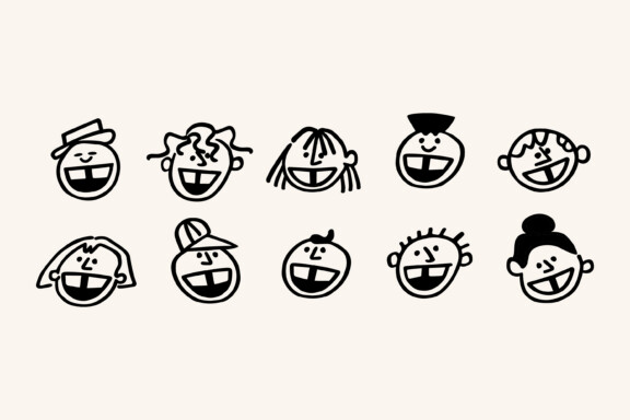
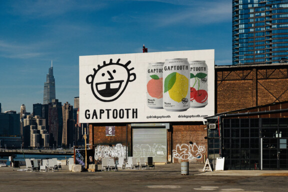
Inspired by the founder’s gap-toothed smile, we reframed something often hidden as something worth highlighting. Nearly a quarter of the global population shares this trait, yet it’s rarely represented — especially in a category defined by polish, minimalism, and sameness.
We partnered with the Gaptooth team to build a brand rooted in individuality, character, and self-expression — something more human, with enough flexibility to scale across flavors, formats, and future touchpoints.
Finding
The identity system embraces imperfection as both concept and design principle — translating a gap-toothed smile into a flexible, expressive visual language.
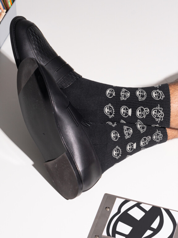
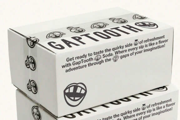
Asymmetry, offbeat composition, and expressive typography replace rigid grids and overly polished aesthetics. Graphic “gaps” appear throughout as a subtle but recurring motif, reinforcing the brand’s origin while creating a distinctive visual rhythm.
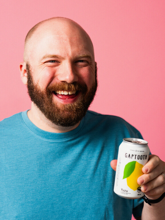
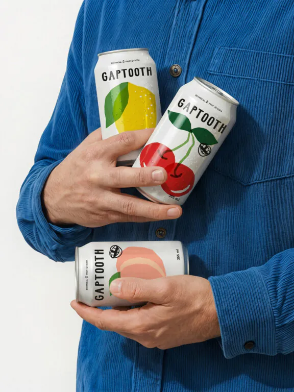
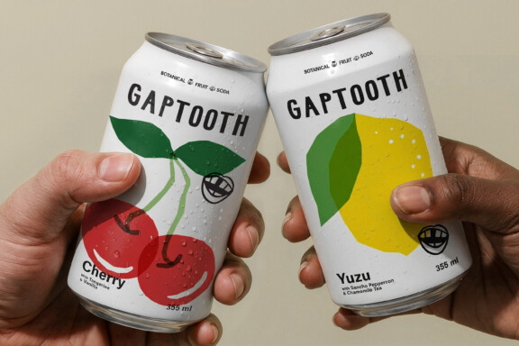
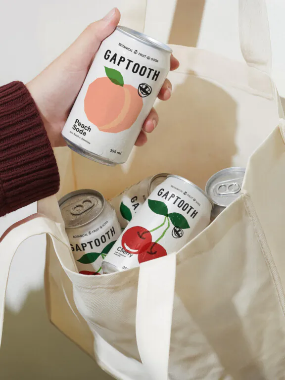
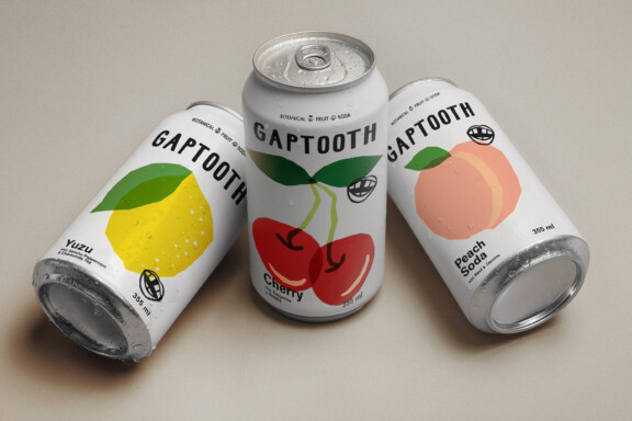
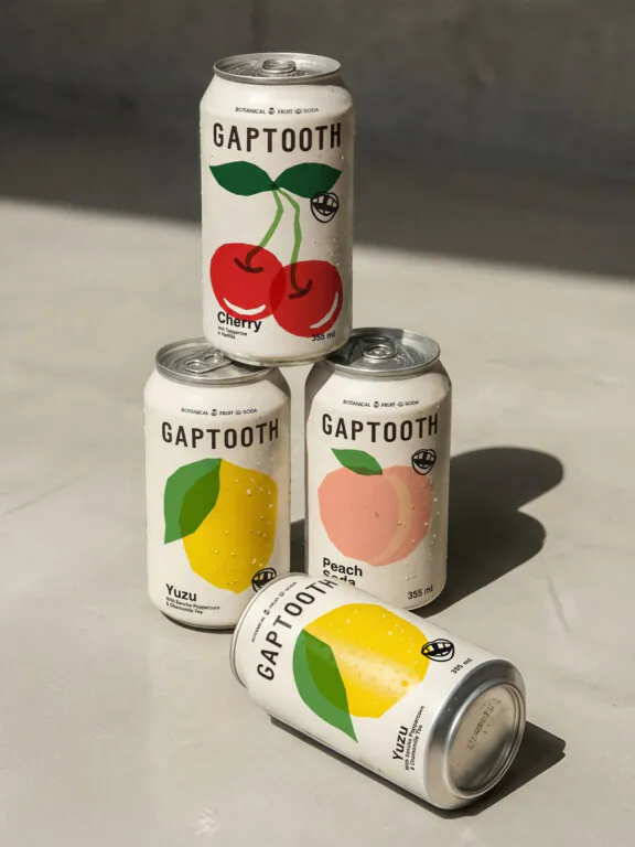
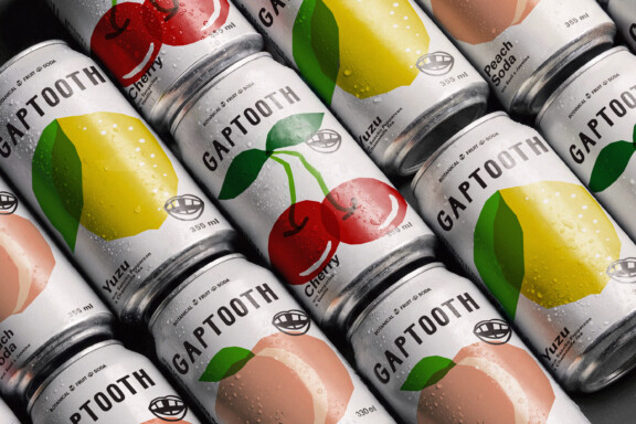
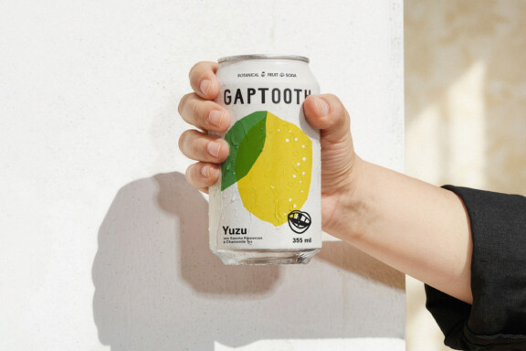
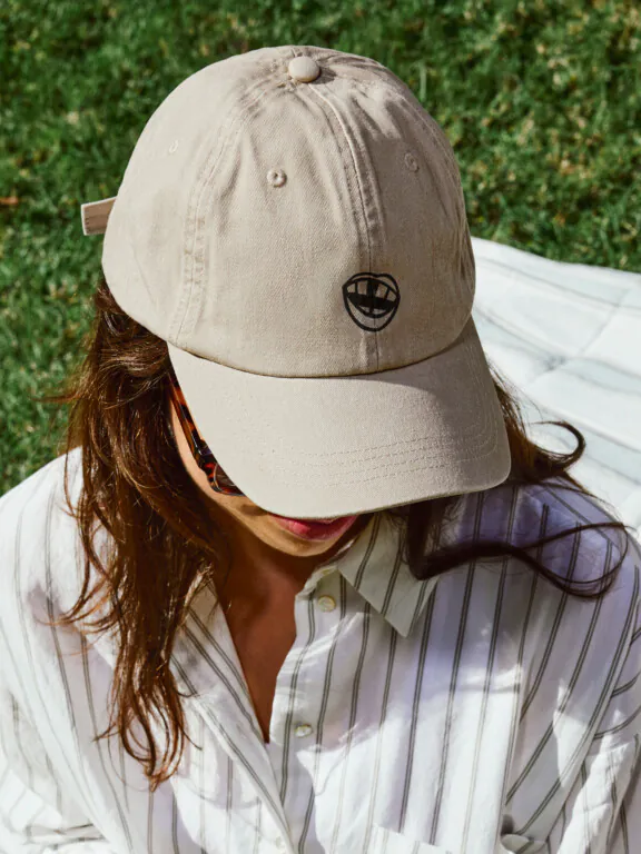
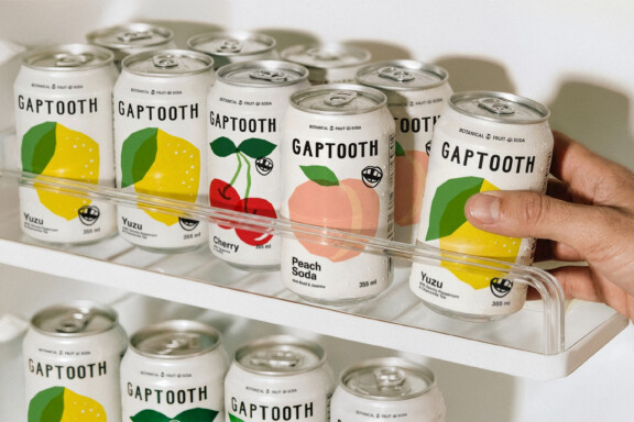
A cast of hand-drawn characters—each defined by their imperfect smile—brings personality across packaging, social, and merchandise. Fruit illustrations follow the same approach: slightly irregular and character-driven, rejecting hyper-realism in favor of something more human.
Bold color blocking ensures strong shelf impact, while a flexible system allows each SKU to feel distinct yet cohesive as a group.
The result is a brand world that is scalable, recognizable, and emotionally resonant—standing apart in a category defined by sameness.