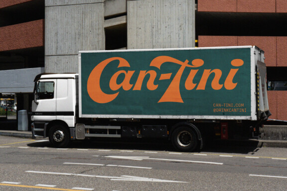
Can-Tini
Wes Anderson & James Bond In a Can.
Industry
- Packaging
- Drink
- Alcohol
Year
Services
- Packaging
- Brand Identity
- Animation
- Copywriting
- Posters
- Strategy
- Web Design
Brief
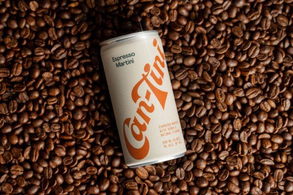
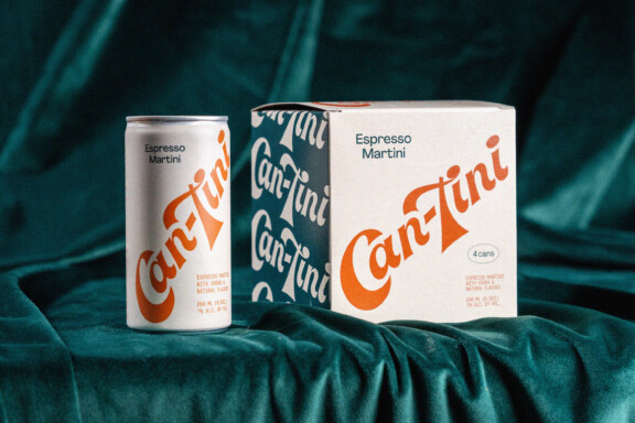
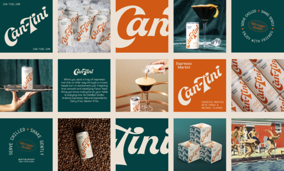
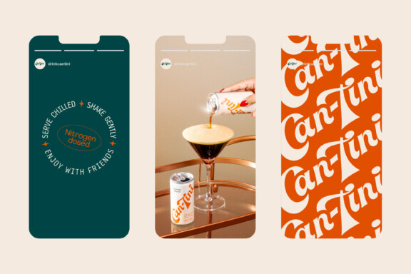
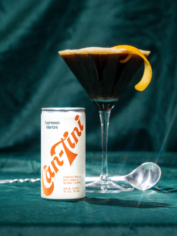
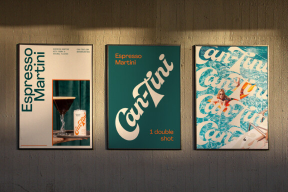
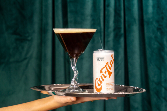
Can-Tini is a new ready-to-drink cocktail brand specializing in Espresso Martinis. With the iconic drink experiencing a massive revival, the folks at Can-Tini approached us with a clear goal: Capture the fun yet sophisticated feeling of ordering an Espresso Martini at a cool bar — and can it. Starting with our clients’ Wes Anderson meets 60s James Bond inspiration, we were tasked with creating a brand identity, packaging system, and animation style that felt retro, bold, fun, and timelessly stylish while appealing to a younger generation of sartorial drinkers.
Finding
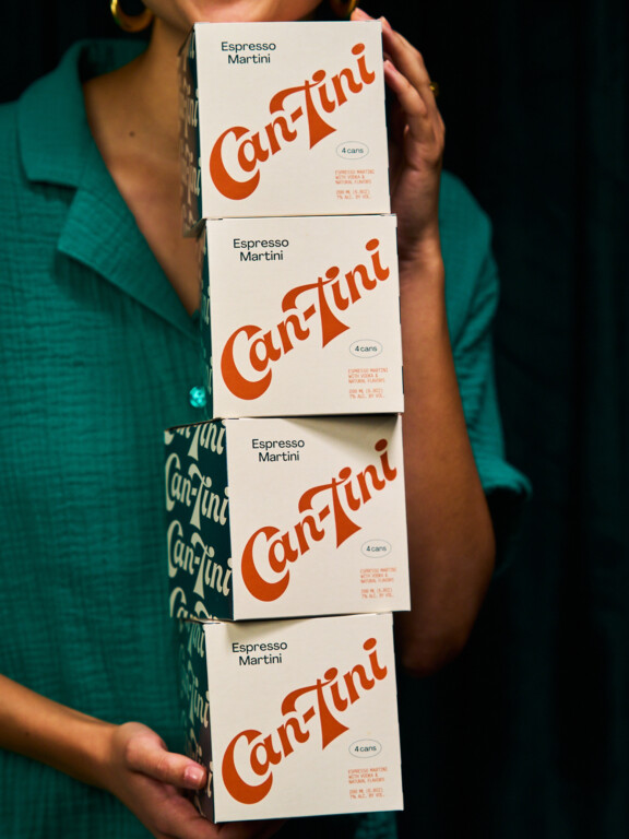
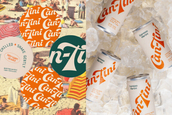
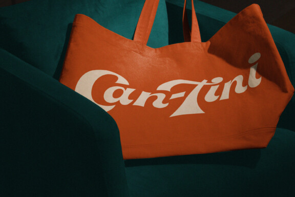
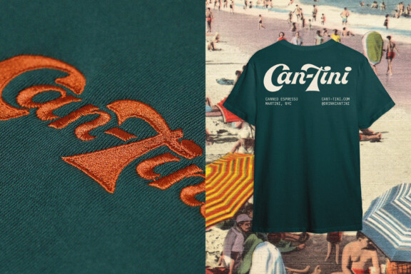
Knowing we wanted to pursue a retro-futuristic direction, we started our research phase by doing a deep dive into late 60s and early 70s Italian magazine archives. We emerged full of valuable insights into the design language of the era and the casual-cool attitude of vintage drinking culture. Using our findings, we created a custom script logo that embodies Can-tini’s playful sophistication and developed a color palette, typographic system, and layout style that, while inspired by the era, was altogether modern and distinct. The logo became the focal point on the cans and boxes, while a repeating pattern added a whimsical touch, complementing the brand’s retro aesthetic.