Massi’s
Massi’s: A Family-Style Italian Sandwich Shop in Queens
Industry
- Restaurant
Year
Services
- Menu
- Brand Identity
- Animation
- Photography
- Signage
- Strategy
- Web Design
Brief
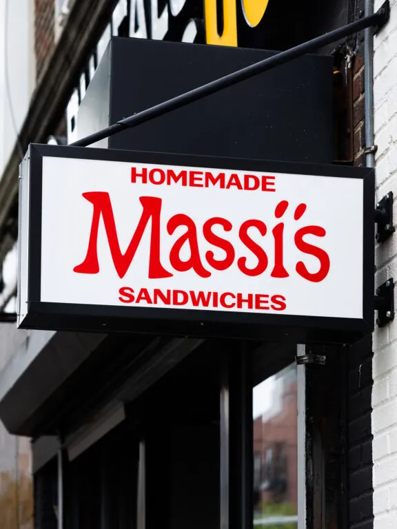
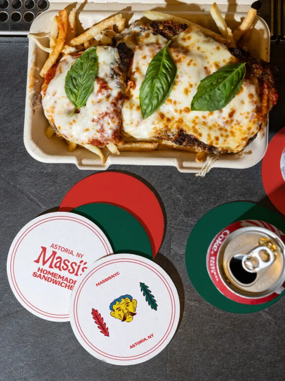
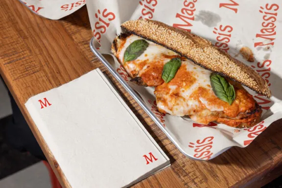
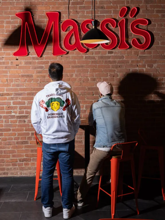
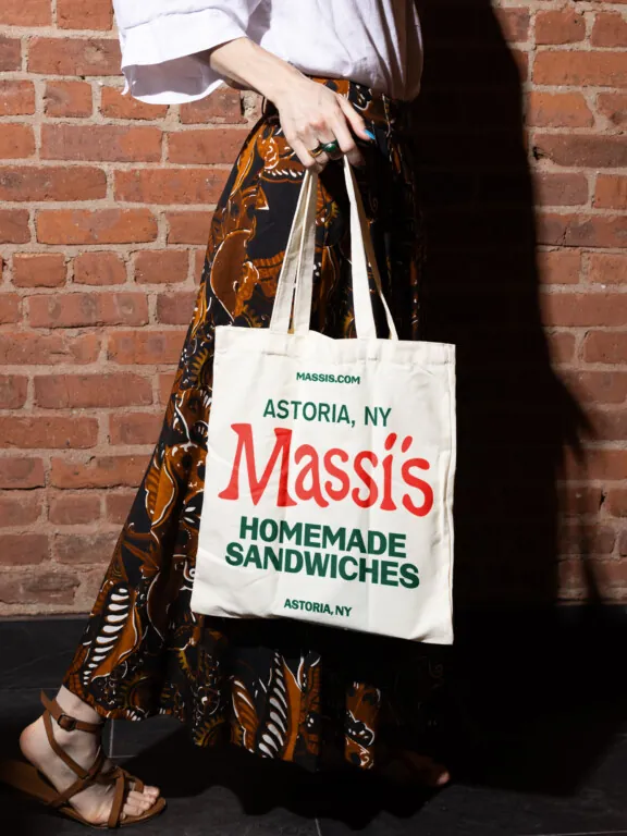
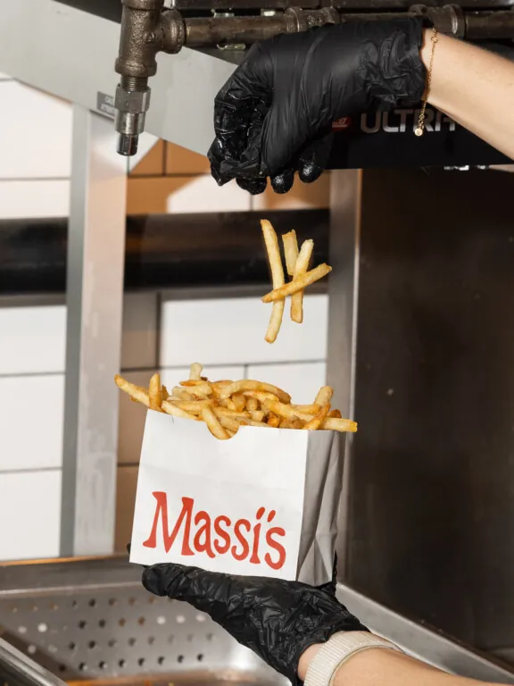
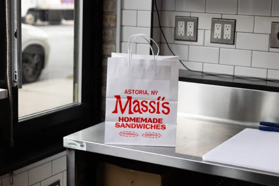
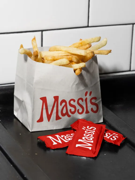
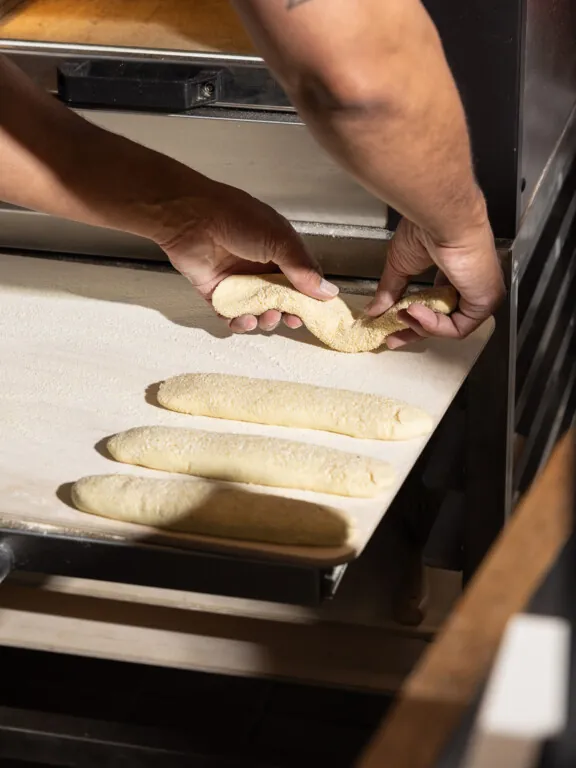
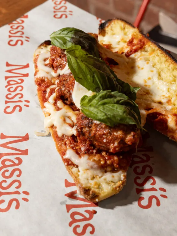
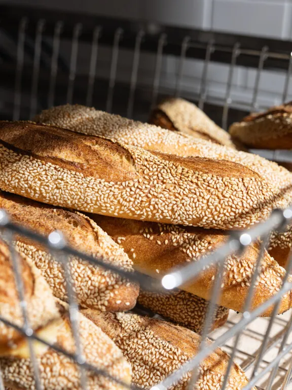
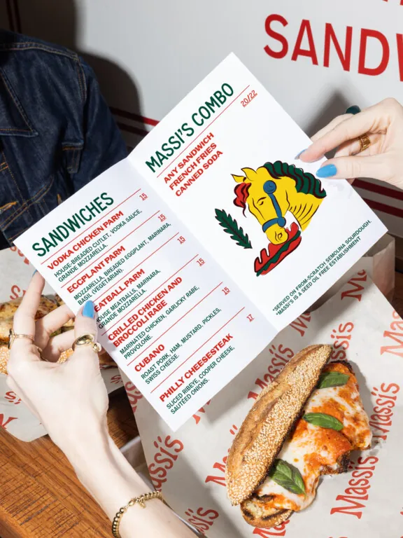
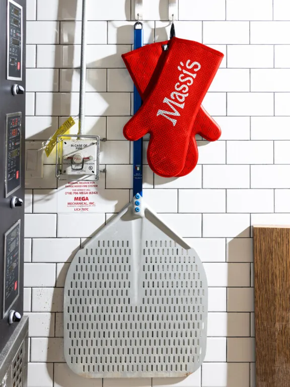
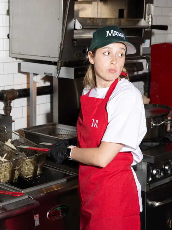
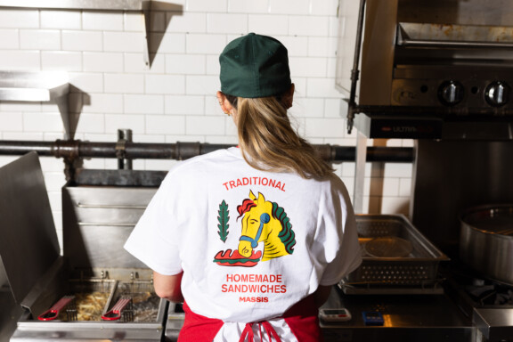
Massi’s came to us with a clear vision: an Italian sandwich shop rooted in family, flavor, and feeling. Named after the chef’s son, the brief was to create something warm, playful, and familiar—like a neighborhood classic from day one. They wanted it to feel like an old-school Italian bakery-meets-deli, tiled walls and all, with amazing bread, beef tallow fries, and the kind of charm only a place named after your kid can carry. Since launching, Massi’s has become a neighborhood staple—families return weekly, the branding is widely recognized, and even the illustrated Scopa characters are starting to appear on merch.
Finding
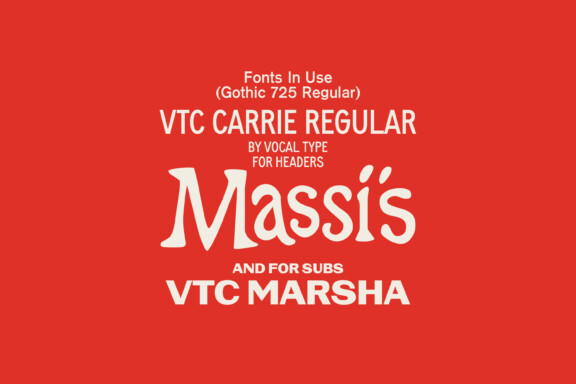
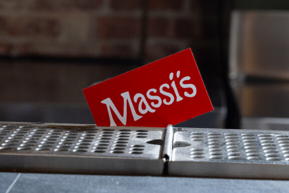
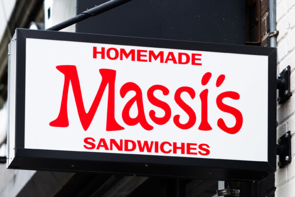
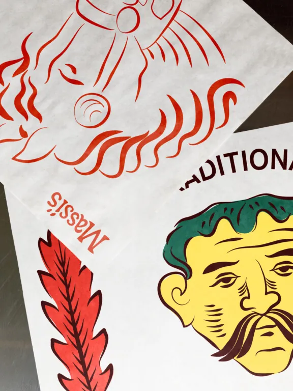
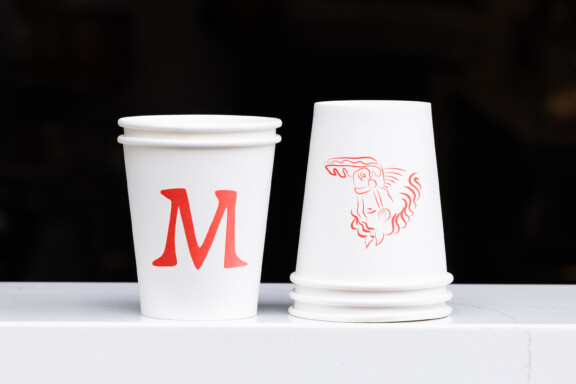
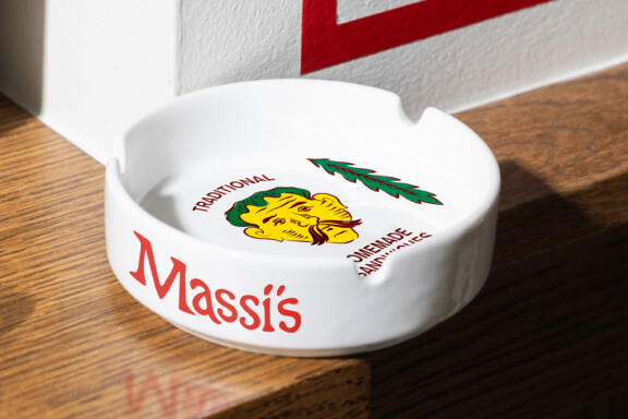
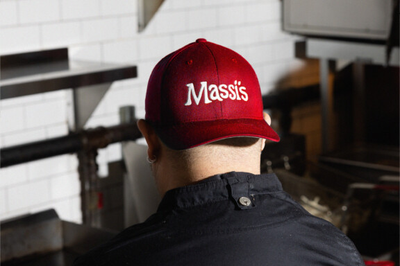
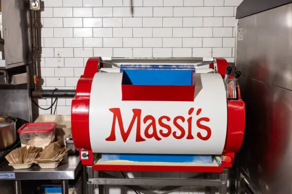
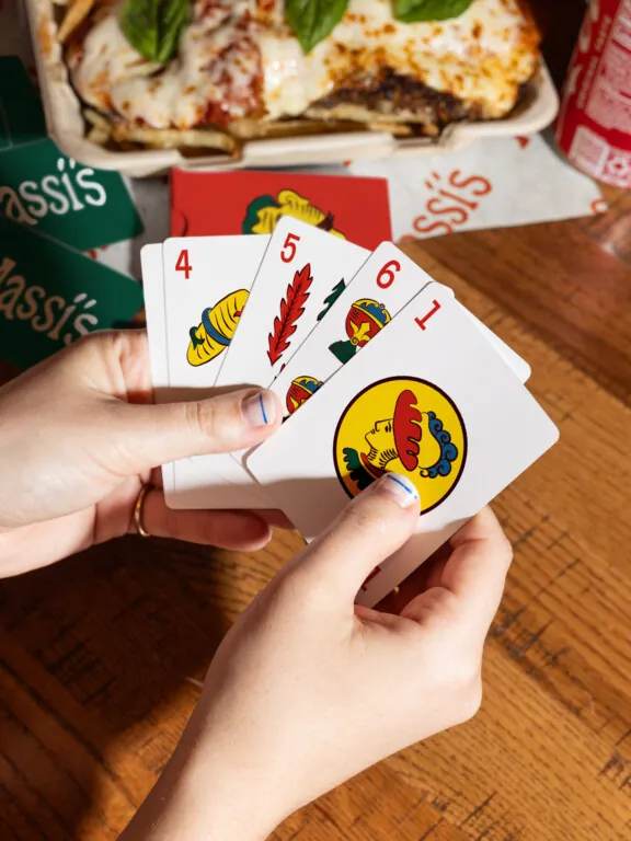
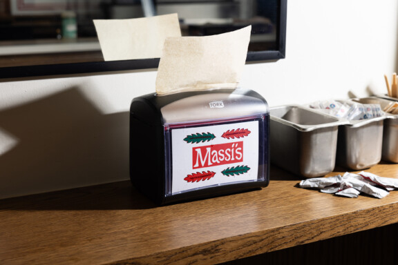
Massi’s identity is rooted in the bold, graphic spirit of Scopa, the traditional Italian card game. We translated its iconic suits and hand-drawn details into a system that feels timeless yet playful. The custom wordmark, inspired by vintage Italian bakery signage, pairs with clean, utilitarian type choices that give the brand a sturdy, handcrafted feel. Combined with a warm color palette and Scopa-inspired illustrations, the result is a brand that balances heritage and simplicity—classic Queens character with an unmistakably Italian soul.