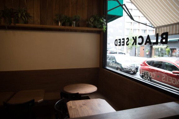
Black Seed Bagels

A Black Seed in a Sea of Sesame
Industry
- Restaurant
- Food
Year
Services
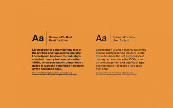
- Branding & Identity
- Copywriting
- Illustration
- Interior Design
- Merch
- Packaging
- Strategy
Brief
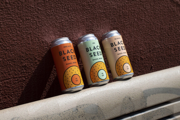
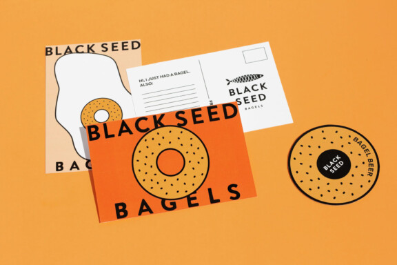
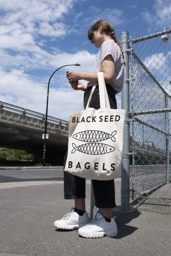
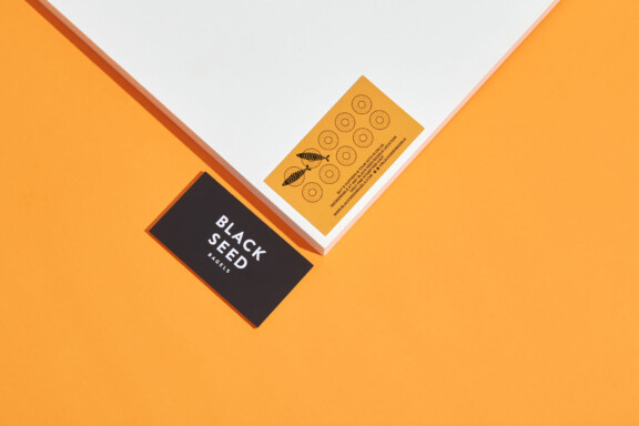
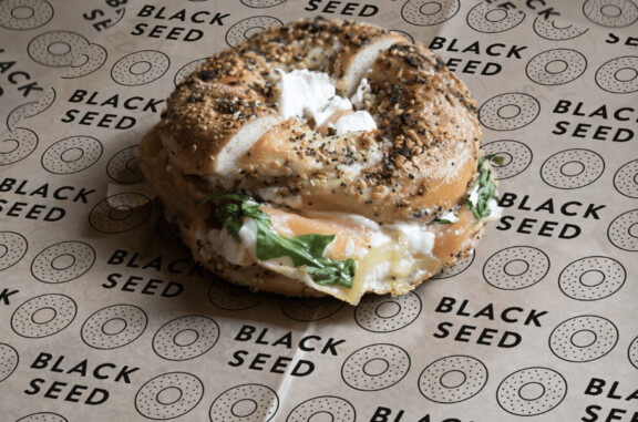
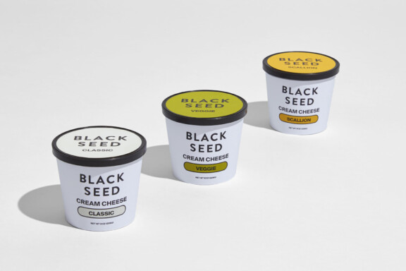
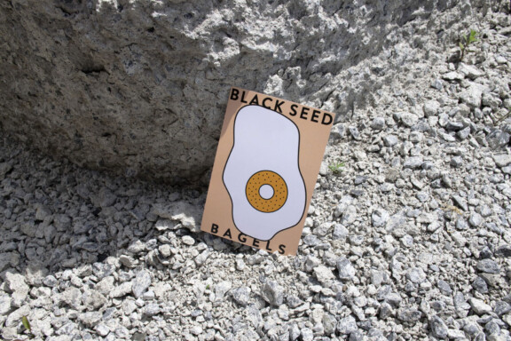
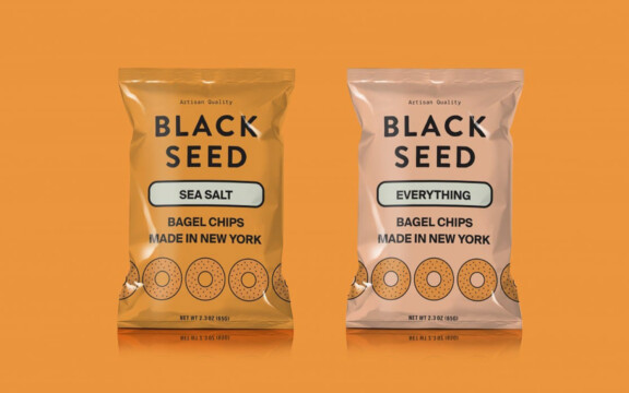
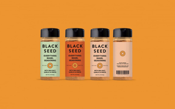
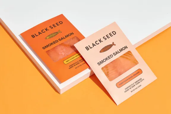
Black Seed Bagels is NYC’s premiere artisan bagel shop known for its hybrid use of Montreal & New York techniques and critical accolades. We were asked to give Black Seed a new visual identity that was connected to the company’s core vision and values while updating its clean, somewhat neutral look, to something more vibrant, engaging and ownable as they expanded their offering from bagels-only to a range of CPG products.
Finding
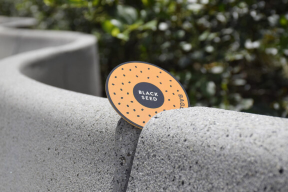
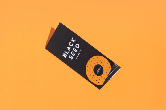
As Montreal transplants living in New York, we speak bagel. During our interview process, we helped ownership identify their core brand positioning as being a “black seed in a sea of sesame” — a reference to the poppy seed. We presented our clients with three different directions with varying degrees of uniqueness with the ultimate goal of arriving at an identity that set Black Seed apart in a highly-saturated market. Our graphic style was built around a figurative bagel which serves as the anchor for the entire identity. As the brand moved into diverse CPG products we applied the same graphic style to different key ingredients and combined them with a bold but clean font kit and a range of vibrant colors. The new Black Seed identity is timeless yet entirely unique, it has all the characteristics of a quintessential bagel brand while standing apart in a way that truly reflects its brand positioning.